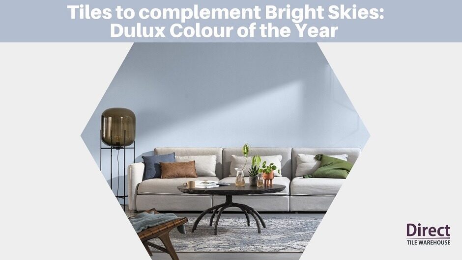
The annual announcement of the Dulux Colour of the Year is always awaited with bated breath here at Direct Tile Warehouse. We are so excited at the shade for 2022, Bright Skies. It adds a lovely injection of colour into the world after the delicate but rather safe choice of Brave Ground in 2021.
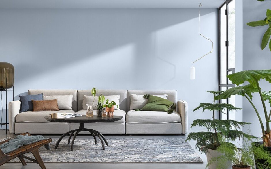
This gorgeous light blue shade will add a lovely calming tone to any wall, to bring an uplifting freshness to your home.
Bright Skies is the 19th Dulux Colour of the Year. It was chosen for its “soulful” qualities by a group of experts from the design, fashion, interiors, social economics, and architecture industries.
The colour was also recognised for its adaptability, which is especially poignant at a time of hybrid working and new routines and is part of a trend toward bright colours and light tones.
Bright Skies: Dulux Colour of the Year 2022
The beauty of a lovely soft hue like Bright Skies is that it works well in both contemporary and classic rooms. And being a pastel colour, the possibilities are endless when it comes to furnishings and décor.
And of course, we’ve selected our favourite tiles to complement or contrast Bright Skies to complete the look.
Complementary Tiles to Pair with Bright Skies
We were thrilled to discover we have a tile in a very close match to Bright Skies. Our delightful Delfos tiles are a wonderful mix of soft blue and grey and will create a vintage statement style throughout your home.
They not only look great but are a wonderfully practical option in hallways, family bathrooms and stylish kitchens with their hard-wearing ceramic and useful anti-slip finish.
Cool
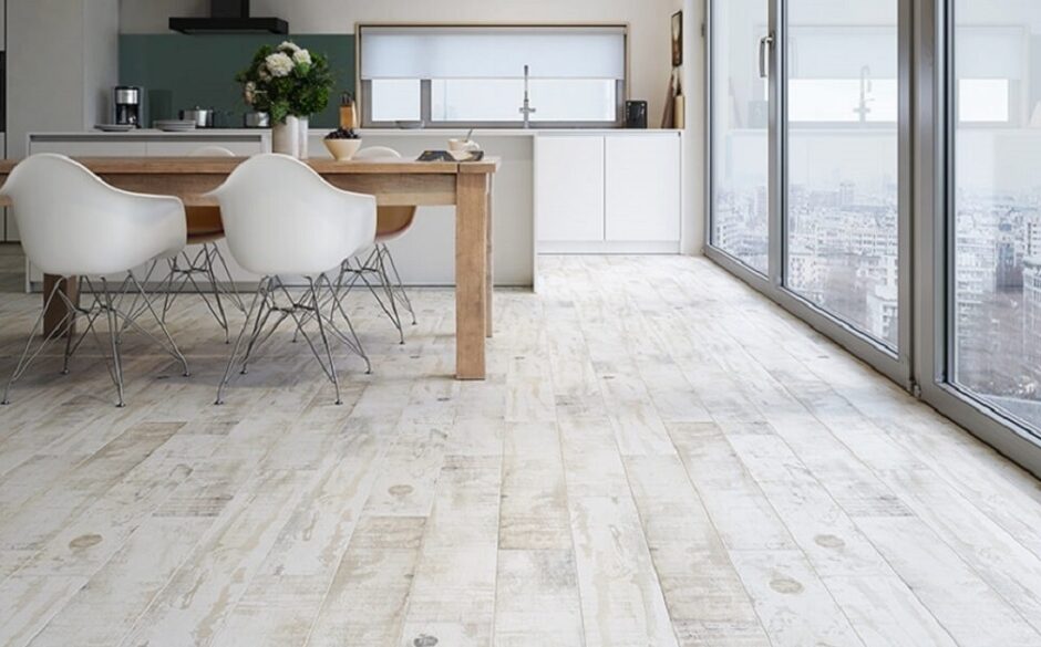
For a natural look, pair the neutral tones of Bright Skies with wood-effect tiles. Our Roof wood effect tiles in a gorgeous shabby chic effect soft white will introduce the luxurious look of floorboards at a fraction of the cost.
Creative
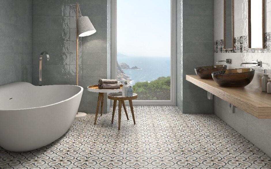
A patterned floor is a great option against a vibrant wall, and our Boulevard tiles in grey and beige would be our top suggestion.
These lovely patterned tiles are a firm favourite amongst our customers for a classic or contemporary feel. They will look fantastic when matched with the Dulux Colour of the Year.
Colourful
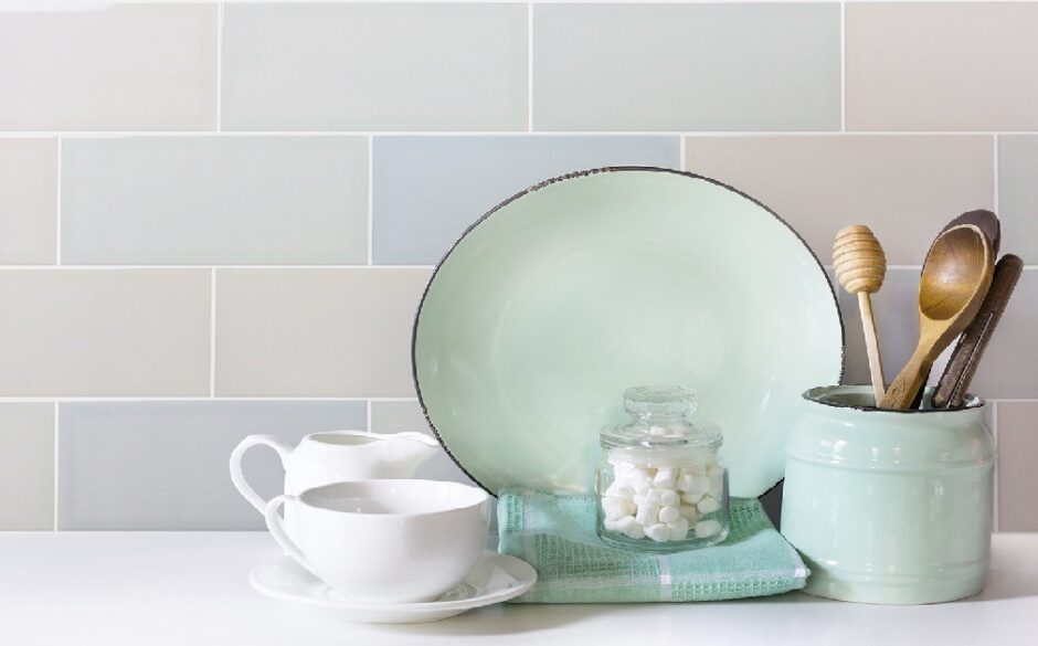
Add a splash of colour and warmth with multicoloured metro tiles to create a rainbow against a wall of colour!
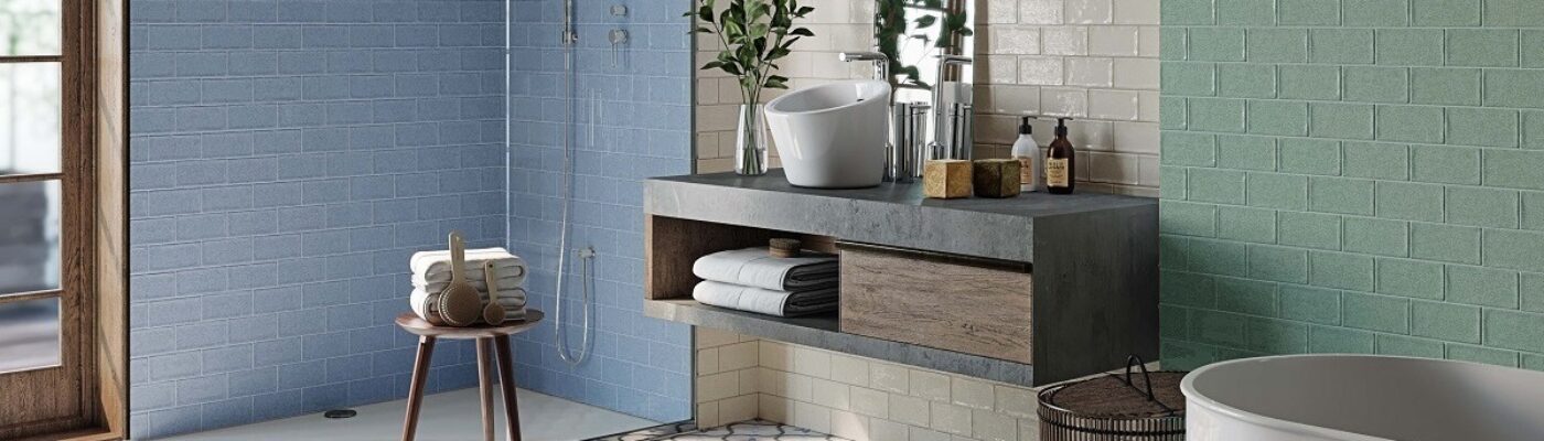
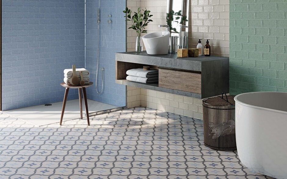
These Eco tiles are a mix of delicate pastel colours that will really shine against the soft blue of Bright Skies. They are ideal as a splashback in a kitchen or bathroom or as an eye-catching feature wall.
Classic Tiles to Pair with Bright Skies
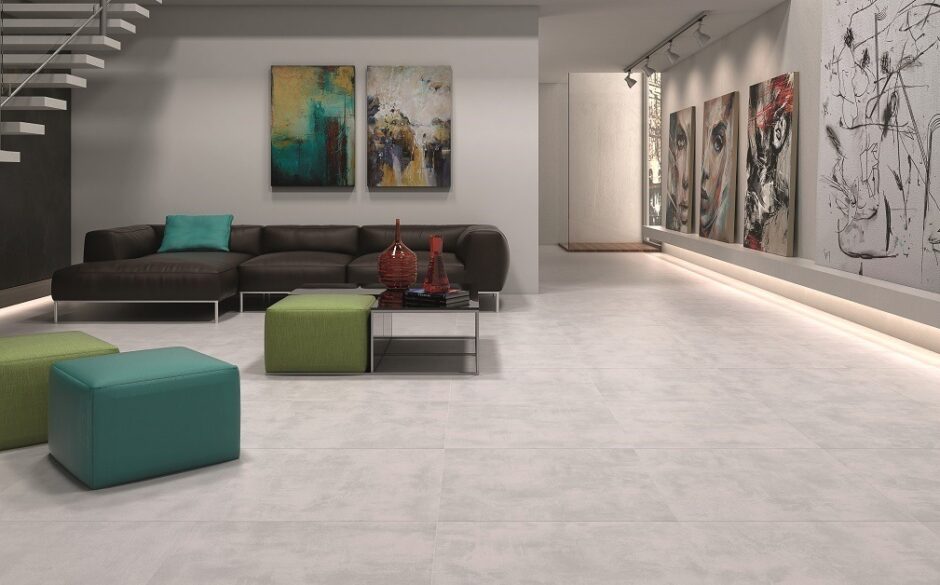
Keep it classy with stone effect tiles for an industrial look softened by a splash of soft blue.
Our Cemento tiles are available in a range of neutral colours that work well with a variety of shades. The perfect tiles and paint combination will help to create a wonderfully chic space.
Character
We like to think we’re always ahead of the game and have been focusing on blue tiles this year! These wonderful Triana Victorian tiles will complement the soft blue colour perfectly. The tiles are a timeless classic that will also look great in contemporary homes as well as period properties.
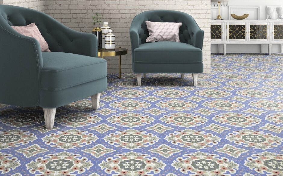
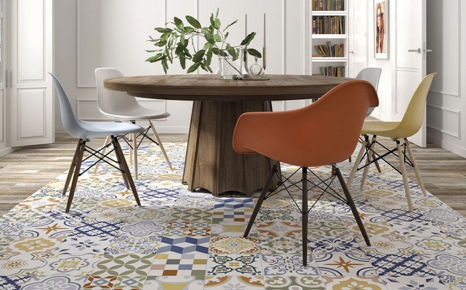
Shabby Chic Patchwork
Patchwork patterned tiles with their whimsical retro feel are ideal for adding a touch of vintage to your room. Consider a blue-based collection, such as our Louvre Patchwork Tiles, with coordinating hues that will complement the colour of the year.
We hope that our post on Dulux Colour of the Year has inspired you to introduce this wonderful hue into your home. If you need any advice or ideas for choosing tiles, please contact us, we’d love to help your design your dream project.